Feeling laid off back
So Thursday of last week, the 26th of September, I saw my boss and her boss in what looked like a serious talk (door shut, faces serious) with a co-worker. About 20 minutes later, as I was working, they came in and as soon as I heard "reorganizing", I thought, I wasn't paranoid Tuesday when another co-worker out of the blue said he needed to be the backup on a site I'd been the HTML/CSS guy on.
Sure enough, they were laying me and the other web guy off. They said they couldn't make money on this whole web design thing and wanted to focus more on backend stuff. This being the third quarter they were supposed to be profitable by of course is completely irrelevant.
Anyone who's been reading Zen Haiku for a time may have seen posts that made me seem burned out. So now I'm feeling primarily anger and a sense of freedom.
So if anyone out there wants to hire a guy who really knows his usability (my Usability applied to life column is sufficiently amusing that Jakob Nielsen linked to it from his Ten Usability Heuristics page), HTML, CSS ( Owen first-child hack anyone?), Javascript (use location.replace() to avoid 0 second bounces!) , HTTP (I've done multiple GETs by hand to track down miscreant ad servers) and been on the Internet since 1991, take a gander at my resume.
The fact that I posted about my cable modem on the 27th, the day after I was laid off, says something. I plan to focus on usability as in the past. I am not going to turn Zen Haiku into a job search blog. Nor am I going to put the name of former employer in my blog proper: anyone who cares can look at my resume.
Posted by Chad Lundgren on Monday, September 30, 2002 (Link)
(See entry on its own, including comments)
Hello? Is this thing on?
I recently starting using a cable modem. I ran into a serious annoyance. I thought it had crashed and spent about 15 minutes checking cables and power cords and turning on my TV to check regular cable, rebooting my computer, all to no avail.
So I unplugged the modem, plugged it back in again. Two lights came on: the Power and PC Link lights.
After all this struggling, I decided to manually turn the power button on and off. So I did so, but then I noticed the Activity light blink for a second. Suspicious, I pushed it once, and lights started blinking faster. So I tried the Internet connection again and it worked.
Sure enough, the modem was "off" with two green lights on, including the POWER LIGHT. What kind of interface idiocy is that?
Pictures make this very clear:
Contrary to what you might think, this modem is "off". 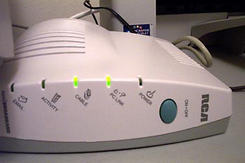
Now, this modem is on. 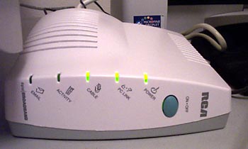
The lights do blink a lot when it's on, but that didn't help. I assumed the lights weren't blinking because something was wrong with my cable or computer. When you first plug in the power cord, the modem blinks in a subtly different way as it boots up, and it's not available then, either.
How is lighting the power light when the modem is "off" sensical? Why is the power light glowing for both "on" and "off" states? That's nonsensical.
So what precipitated the whole thing? Well, my theory is that it had to do with the sock. See, I find those blinking lights annoying and covered them with a black sock.
On a slow modem, I cared about activity because I had to. On a fast cable modem, I don't want to. I want it always on, till further notice. I must have accidentally pushed the power button through the sock.
Posted by Chad Lundgren on Friday, September 27, 2002 (Link)
(See entry on its own, including comments)
Don't link to us!
I'm such a web geek I punch in web addresses I hear on the radio. One such was the web site for an upscale dining magazine for Albuquerque and Santa Fe called La Cocinita—Spanish for "Kitchen." I wanted the "Around Albuquerque" column, which is about restaurant news.
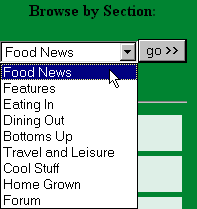 Being a web geek, I zoomed in on the dropdown menu on the the home page. I found "Food News" too abstract. I had to guess that it had "Around Albuquerque" columns in it. "Around Albuquerque" and "Santa Fe Scoop" need to be items on the menu.
But that's not even the most annoying thing. I ran into one of my pet peeves, which I've referred in the past without explaining: They made it hard to link to a specific page by using a POST rather than a GET.
You want that without technobabble? OK, here goes. There are two ways to send in the stuff in a web form after you click the submit button: A GET or a POST. (In this case, using the dropdown sends in the form.)
The POST method puts some of the stuff that should go in the link elsewhere, and a Favorite that uses a POST will either dump you on a generic page or the middle of no-where if you try to do the site the favor of revisiting. (I could explain what elsewhere is, but trust me, it won't help) Show and tell time.
Here's a POST. Notice how short it is:
![]()
In a GET, on the other hand, a full link shows up in the Address area of your browser, and if you add this Address to your Favorites, it will work.
Here's a GET. It's longer, but it takes you to the page you want: ![]()
GETs are almost always better. I'm not saying a POST should never be used: if I'm submitting credit card information, they better be using a POST for the increased security. Yes, GETs are more usable than POSTs.
Funnily enough, the link to the advertising page uses a GET.
So I cobbled together a link to the Food News page. The most current column (September) is way at the bottom. I thought January was the last time it had been updated at first, which didn't make any sense with the Radio Free Santa Fe ad I just heard. (Radio Free is, so far, still worth listening to despite having been acquired by Clear Channel. This Clear Channel link [was] another GET link I had to create by hand. (3/25/2003: Update: the link is broken, and Clear Channel is hiding their radio station stuff on their site. I have removed the links below)
The listing on Clear Channel call[ed] Radio Free "Classic Rock" on the Albuquerque listing page, but
"Adult Alternative" on the detail page. I know why it got screwed up: it's because they moved the station to 104.1, which used to be a Classic Rock station. It's a much better signal you can listen to all the way to Santa Fe and back to Albuquerque.
I would email them, but Clear Channel's contact page lists only phone and street address. Helpful.
Why do people still make it hard to link to them, when it's been known for years (scroll to number 7) this is a bad idea?
Posted by Chad Lundgren on Thursday, September 26, 2002 (Link)
(See entry on its own, including comments)
A haiku
Discipline your eyes.
Don't let them wander on me,
Make me feel like that.
Posted by Chad Lundgren on Wednesday, September 25, 2002 (Link)
(See entry on its own, including comments)
TrackBacking
So Joshua Kaufman mentions [Or not, he is giving the 410 message to a bunch of his stuff - link removed 03/25/2004] that he doesn't see a lot of TrackBacking going on.
Having just upgraded to MT2.21, my theory is that it's due to two things: 1) It's a cool idea, but not everyone gets it. I don't think it was initially explained as well as it could have been. Joshua does a good job of explaining, actually. 2) It took me more trouble to get Trackback implemented than the actual upgrade from MT2.1 to MT2.21.
I suspect I'll put more details up about this at a later date, when I have more sleep.
Update: when Joshua says "Usually I simply forget to send the TrackBack ping..." it gets me. Maybe it's the hour, but that sets off usability bells in my head. I would think that there has to be a better way than cutting and pasting URLs around.
Plus, I assumed for some reason that my second ping would replace my first, since it was the same post. I often don't bother with excerpts, but with a TrackBack entry, it's more important. Now I have two entries floating around over on Joshua's TrackBack page. (And is it weird to link to a TrackBack page on the post that started it? Seems a bit circular somehow)
I'll refrain from a tedious anti-popup window rant and let my site speak for itself.
Posted by Chad Lundgren on Wednesday, September 25, 2002 (Link)
(See entry on its own, including comments)
Site changes
I've made some changes. One that I just saw what someone was talking about involves the text in the top getting cut off. It appears to be working in IE6.
The other involves a horizontal scroll bar that was showing up unneeded in both IE6 and Netscape 6/Mozilla 1.
(START Web geek speak: I added a comment for the IE6 issue and a width: auto for the Netscape issue. This got IE6 most of the way there, but in in the standards mode the IE6 invokes, there was a little extra space. Some pounding on google found a cached page, all of which was unreadable Asian characters except for 3 lines of CSS, the relevant one of which was: body {overflow: hidden !important} which I took and applied to the top area div. In other words, since IE6 thinks there's extra, make it not show it. END web geek Speak)
In a slightly less geeky vein, last but certainly not least, I've upgraded to Movable Type 2.21 and switched to using MySQL. This would have been less grim if I hadn't commented out the old database location, which meant nothing got transferred over, including my username. Fortunately, my hosting company has a decent web interface to look at the database, and I saw it was empty, and realized what had happened, blew away the empty tables, and re-did the switchover.
Now, I'm going to see if I can get this TrackBack thing to work....
Posted by Chad Lundgren on Tuesday, September 24, 2002 (Link)
(See entry on its own, including comments)
My first Usenet posting?
It's embarrassing enough. The program I was posting with to a Usenet discussion group didn't automatically word wrap. Google faithfully preserved the incredibly long third line that resulted from my failure to hit Enter at the right spots. Someone later in the thread complains about it, in fact.
Why should I have had to remember to word wrap? They'd invented word wrapping by then. Usability issue!
Here's the posting in its textual glory:
My first Usenet post in plain text format.
And here's the full thread.
I found this to show I have been on the Internet for 10 years. I was tempted to use another less embarrassing post, of nearly the same vintage, but this one, with its horizontal scrolling, shows how far back usability issues go.
Posted by Chad Lundgren on Tuesday, September 24, 2002 (Link)
(See entry on its own, including comments)
Plastic Plant Sundays
Not only I am writing more rhymed poetry, I'm getting into structure as well. This one, a poem I mentioned a long time ago, is a villanelle.
Plastic Plant Sundays
The blankness of the booth accuses me,
The other seat stares at me silently.
The blankness of the booth accuses me,
I stare at the plastic plant on the wall,
The other seat stares at me silently.
Ah, weekend sex for my mendacity—
I was more plastic than her plants that fall.
The blankness of the booth accuses me.
Sharing Sunday breakfast banality—
Later one Sunday, dish washing tears fall.
The other seat stares at me silently.
A young girl sits one booth over from me,
Her boyfriend-to-be toward the wall.
The blankness of the booth accuses me.
As I scribble, my eyes dart glancingly—
Her flushed cheeks silently take me in thrall.
The other seat stares at me silently.
She talks of "unused sexual energy".
Just like a woman—three words and you're small.
The blankness of the booth accuses me,
The other seat stares at me silently.
Posted by Chad Lundgren on Monday, September 23, 2002 (Link)
(See entry on its own, including comments)
Faux Pas- Linguistic and Social
I took a linguistics class at UNM for which we collected slips of the tongue—what the professor called linguistic faux pas—and categorized them.
My brother Jeff committed my favorite faux pas. He was sitting on the couch, reading one of those Choose Your Own Adventure books. I was watching TV, and he was trying to read and watch TV at the same time. He looked up and said to me, "Turn it to page 7." The show he wanted to watch was on Channel 7, and I of course was holding the remote.
I classified this one as a pragmatic, or contextual error: what made perfect sense for one context got used in another without adjustment.
I was reminded of this class last night as was about to brush my teeth. I picked up my toothbrush and reached out for the liquid soap bottle. Right category (cleaning product), wrong product. I stopped myself in time.
My brother Jeff also committed a bizarre error. He said something which sounded like a sentence, had the prosody (rhythm) of a sentence, even had syllables that belonged in the English language, but not one of those syllables meant a damn thing. His sentence worked at the phonemic (or sound) level, but failed utterly at the morphemic (or meaning) level.
I'm not sure how to clasiffy this slip of the tongue. (A PowerPoint presentation converted to web format)
The way my brain is wired, I often lose context. About 6 months ago, I had my eyes checked. I signed up for the machine that checks your peripheral vision. This is the machine where you click a button on this clicker whenever you see a pinpoint of light.
After I finished with the left eye, I set the clicker down. I talked about some stuff, and then asked the (red-head, cute, woman) eye doctor "Oh, could you hand me the clicker thing?"
She gave me an odd look and said something to the effect of No, pick it up yourself. I looked down: I had no memory of it, but it was in my lap. I turned beet red and apologized, explaining that I'd thought I'd set it on the table. Her timing was impeccable: as soon as I apologized, she was already joking, saying "That'll cost extra" in that Brooklyn accent. Yes, some faux pas, but not most, are Freudian slips
Posted by Chad Lundgren on Thursday, September 19, 2002 (Link)
(See entry on its own, including comments)
Short Term Memory
I had the impression that CompactFlash memory was much cheaper online than in the stores. With my digital camera, I needed to try it hands on, but not so for a memory card.
So I went to NewEgg.com, which is where my company bought components for my current computer for good prices. I'd already noted that NewEgg seemed a little odd on an earlier pricing expedition, but it was only as I waded in that the full gratuitous weirdness manifested.
I grumbled about registering, but I started to do so.
I received a bizarre error message:
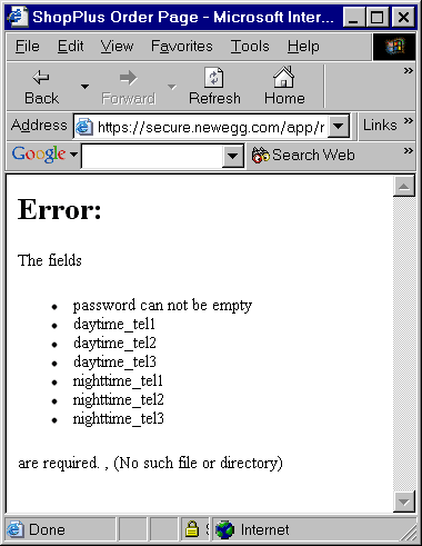
An error message with an error in it. How ironic. Not inspiring of the warm and fuzzies. But heedless, I trekked on, to figure out if the phone numbers were optional or not. (Never mind that they didn't use real English names for their form fields.)
So I'd thought the phone numbers were optional: 
Then I wondered if it was the extension that was optional. Sure enough, as I resized my text, it made much more sense: 
Don't word wrap! There are many ways to keep the "Optional" where it belongs.
After an incredibly looooooooong pause (granted, I'm on a 56K modem) it comes back and tells me the zip code and state don't match. I've picked New York instead of New Mexico. At least the error message is next to the error.
Then I noticed this:

Here I am, trying to buy some memory on a site that doesn't have any when it comes to my spam preferences. I don't know why that was the straw the broke the camel's back, really the error message with the error message in it should have.
I mean, how insecure and graspy does a site need to be to keep on resetting the spam preferences?
So I went to Amazon.com, assuming it would cost more. OK, it did, but by about $2. I'm not that price sensitive.
Why Amazon? It's an online name brand, of course. But what cinched it was an online memory finder. This assured me somewhat: this is the first CompactFlash I've bought, and I didn't want the wrong kind. It may be totally unnecessary, but it made me feel better.
One annoyance for both sites was my credit card. I'd just like to single out the geniuses at Wells Fargo, whose card with the stage coach background makes the letters very hard to read. Fortunately, their online banking is better.
Posted by Chad Lundgren on Saturday, September 14, 2002 (Link)
(See entry on its own, including comments)
Zozobra
Sometimes it's really cool to live in New Mexico. While working on a site I can't talk about until it launches, I was in Santa Fe late enough where I said heck, I'll should go to Zozobra again like I did last year.
Zozobra, of course, is Old Man Gloom, and you burn him to get rid of your woes. The effigy burning/music festival happens right before the Fiestas Days in Santa Fe which have been going on for hundreds of years.
I managed to get some pictures too. Most of them didn't come out, because the big effigy is slowly thrashing and my shutter speed is not adjustable.
 Here's the least blurry picture of Zozobra, right before he get torched, with fireworks smoke all around him.

My favorites are the fire jugglers anyway, which came out a bit better.
Zozobra explodes.

Zozobra in full flame.

Zozobra is apparently based on an old Indian ritual, or pagan, as the religious folks would think, which outrages both the Catholic and Protestant religious folks in Santa Fe. Religious pamphleteers and banner wavers were out in force (again) this year, which only made the walk back to the car more fun. This year they stayed out the middle of the street.
The really bizarre thing about Zozobra though, is that the Kiwanis Club of Santa Fe puts it on. Go figure.
It's also where, last year at the 75th Burning of Zozobra, I (re-?)invented the term "secondhand ganja." The secondhand ganja factor was about the same, maybe a bit higher this year. (Just for the record, I don't think the secondhand ganja is really enough to have an effect.) There were also an outrageous number of beautiful women and girls there.
A nice Dionysian time, considering I didn't drink anything.
Posted by Chad Lundgren on Sunday, September 8, 2002 (Link)
(See entry on its own, including comments)
Camera blues (and yellows)
I bought a new digital camera, a Kodak DX3500. Overall, it has solid usability: other cameras have annoyed and irritated me far more.
One thing drives me crazy, though. When you're scrolling through the pictures and pull up the delete function, sometimes, but not always, it jumps to the first picture, not the picture you're on. If you're going too fast, you end up deleting the wrong picture. No way of getting back.
Nice features:
- The preview mode is accurate, and avoids any parallax issues for close-up shots. It operates at 20 frames a second and is a nice looking screen. Does tend to nail the batteries though.
- You can turn the flash off.
- The focus and exposure are both automatic. No waiting for the focus to snap into place like with other cameras, which I hate.
- The menus make sense: have clear language.
Annoyances:
- The focus and exposure are both automatic. Since it's fixed focus, I don't see that changing, but I would like more control over the exposure.
- The aforementioned jumping around when you're trying to delete things.
- The digital zoom quality is only good enough for web resolution, and then not for bigger images or tight crops.
- You cannot leave the self-timer as the default. I had one picture of my hand reaching for the camera.
 I was bored with the available lighting, so I used my Revo sunglasses as a filter, which worked pretty well, as Revo likes to brag about their optical quality lenses. (It's a Flash page). [Update 03/25/2004 - Link removed, but you can still go to Luxxotica, click on Brands, then Revo and be treated to a big Flash movie. In Italian, even though the page I was on clearly was in English. ]
(The indivdual entry contains more pictures).
Posted by Chad Lundgren on Wednesday, September 4, 2002 (Link)
OK, here's a few pictures. I don't plan to use a huge number of pictures, but I do plan to get relevant pictures, if I can take them of usability-related things without getting thrown out (sounds like a future entry). Click on any of the pictures for a bigger view.
 The side of my apartment building, lit dust
 This shot was done with the Revos backwards.
(See entry on its own, including comments)
Most Popular
- Seattle Sunset background image
- Usability applied to life
- Is "My Bad" Bad?
- Free Password Previewing Tool version 2.3 (146 Kb)
- Sunset in New Mexico background picture
- Bath and Body Works
- Atkins.com: Lose the Table Fat
General
Other Web Logs
Categories
- Adminstrative: 11 entries
- General: 51 entries
- Personal: 2 entries
- Photography: 13 entries
- Poetry: 8 entries
- Usability: 71 entries
Archives
- October 2006
- February 2006
- July 2005
- June 2005
- March 2005
- December 2004
- September 2004
- August 2004
- July 2004
- June 2004
- May 2004
- March 2004
- February 2004
- January 2004
- December 2003
- November 2003
- October 2003
- September 2003
- August 2003
- July 2003
- June 2003
- May 2003
- April 2003
- March 2003
- February 2003
- January 2003
- December 2002
- November 2002
- October 2002
- September 2002
- August 2002
- July 2002
- June 2002
- May 2002

Unless otherwise expressly stated, all work on this site including photos, poems, and web logs entries are licensed under a Creative Commons License.
