Ice Cream Follies
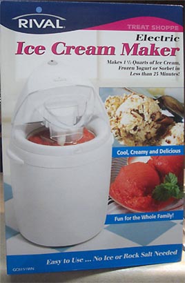
My girlfriend and I are enjoying a show called Good Eats, featuring the wacky Alton Brown, which inspired us to make our own ice cream. The show tells us you want the ice cream maker that does not require ice. We buy a reasonable looking model from a company named Rival®. Notice the label reading "Easy to Use... No Ice or Rock Salt Needed". [Update 03/25/2004 - Updated the URL to add an "x" to an "asp". Sigh. This page lumps all their ice cream makers into one page and does not show any detail.]

We follow the recipe and pre-cool it in the fridge. We load the ice cream in the ice cream maker and turn it on. It's noisy. It should take 30, but at 15 minutes in, it's not thickening.
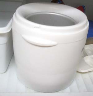
Then my girlfriend looks in the manual and laughs. You have to freeze it over 20 hours before using it. It's basically a huge version of one of those frozen mugs.

What's up with that? Talk about a misleading label. My girlfriend and I had both assumed there was cool endothermic machinery involved. A quick Google search reveals that this is true of all iceless ice cream makers.
Posted by Chad Lundgren on Saturday, May 31, 2003 (Link)
(See entry on its own, including comments)
My DVD player flashes 12:00!
I've recently started a job involving supporting a consumer electronics device, so I've been thinking about the usability of consumer electronics a lot lately. The piece of equipment in question has a phone jack. Not too infrequently, the other end of the phone line ends up plugged into a satellite dish box, not the wall.
The plug on these satellite boxes allows another device to control them. But the makers clearly did not understand that your average consumer finds which plugs fit, and starts plugging things in. Those who have read their Donald Norman call these perceived affordances, or affordances for short. My one sentence gloss: What does it look like I can do with it?
The most famous example of affordances from Donald Norman's book Design of Everyday Things is doors. A pull handle should indicate that the door is opened via pulling. A push plate indicates the door should be pushed and which side to push on. The infamous convenience store doors with pull handles on both sides are a common example of ignoring this idea.
Other people have written about the usability of consumer electronics, or the lack thereof. I also found a story about a GE dishwasher I saw on WebWord amusing.
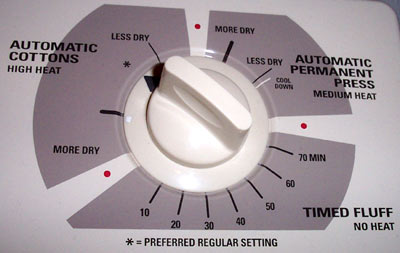
Speaking of GE, all this inspired me to photograph a dial on the GE dryer in the apartment my girlfriend and I moved into recently.

Since I was not wearing my contacts, I peered at this dial from about 3 inches away and was audibly annoyed because I was looking for the 60 minute drying setting. The only timed setting available on this dryer is for fluffing. I do not trust my dryer to know what "More Dry" and "Less dry" really are. And what's up with the "Preferred Regular Setting"?
Posted by Chad Lundgren on Tuesday, May 20, 2003 (Link)
(See entry on its own, including comments)
US Twenties to be slightly prettier
The New US 20s were unveiled (via daypop)
I wanted the whole bill a different color. It's a typically wimpy change on the part of the government. Better than no change, I suppose, given my loathing for boring greeness of American money.
Posted by Chad Lundgren on Wednesday, May 14, 2003 (Link)
(See entry on its own, including comments)
Jack Kerouac haiku
I didn't know Jack Kerouac wrote haiku. [Updated 03/25/2004 - two links removed, one added.]
Posted by Chad Lundgren on Tuesday, May 6, 2003 (Link)
(See entry on its own, including comments)
Most Popular
- Seattle Sunset background image
- Usability applied to life
- Is "My Bad" Bad?
- Free Password Previewing Tool version 2.3 (146 Kb)
- Sunset in New Mexico background picture
- Bath and Body Works
- Atkins.com: Lose the Table Fat
General
Other Web Logs
Categories
- Adminstrative: 11 entries
- General: 51 entries
- Personal: 2 entries
- Photography: 13 entries
- Poetry: 8 entries
- Usability: 71 entries
Archives
- October 2006
- February 2006
- July 2005
- June 2005
- March 2005
- December 2004
- September 2004
- August 2004
- July 2004
- June 2004
- May 2004
- March 2004
- February 2004
- January 2004
- December 2003
- November 2003
- October 2003
- September 2003
- August 2003
- July 2003
- June 2003
- May 2003
- April 2003
- March 2003
- February 2003
- January 2003
- December 2002
- November 2002
- October 2002
- September 2002
- August 2002
- July 2002
- June 2002
- May 2002

Unless otherwise expressly stated, all work on this site including photos, poems, and web logs entries are licensed under a Creative Commons License.