Don't link to us!
I'm such a web geek I punch in web addresses I hear on the radio. One such was the web site for an upscale dining magazine for Albuquerque and Santa Fe called La Cocinita—Spanish for "Kitchen." I wanted the "Around Albuquerque" column, which is about restaurant news.
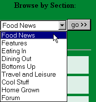
 Being a web geek, I zoomed in on the dropdown menu on the the home page. I found "Food News" too abstract. I had to guess that it had "Around Albuquerque" columns in it. "Around Albuquerque" and "Santa Fe Scoop" need to be items on the menu.
But that's not even the most annoying thing. I ran into one of my pet peeves, which I've referred in the past without explaining: They made it hard to link to a specific page by using a POST rather than a GET.
You want that without technobabble? OK, here goes. There are two ways to send in the stuff in a web form after you click the submit button: A GET or a POST. (In this case, using the dropdown sends in the form.)
The POST method puts some of the stuff that should go in the link elsewhere, and a Favorite that uses a POST will either dump you on a generic page or the middle of no-where if you try to do the site the favor of revisiting. (I could explain what elsewhere is, but trust me, it won't help) Show and tell time.
Here's a POST. Notice how short it is:
![]()
In a GET, on the other hand, a full link shows up in the Address area of your browser, and if you add this Address to your Favorites, it will work.
Here's a GET. It's longer, but it takes you to the page you want: ![]()
GETs are almost always better. I'm not saying a POST should never be used: if I'm submitting credit card information, they better be using a POST for the increased security. Yes, GETs are more usable than POSTs.
Funnily enough, the link to the advertising page uses a GET.
So I cobbled together a link to the Food News page. The most current column (September) is way at the bottom. I thought January was the last time it had been updated at first, which didn't make any sense with the Radio Free Santa Fe ad I just heard. (Radio Free is, so far, still worth listening to despite having been acquired by Clear Channel. This Clear Channel link [was] another GET link I had to create by hand. (3/25/2003: Update: the link is broken, and Clear Channel is hiding their radio station stuff on their site. I have removed the links below)
The listing on Clear Channel call[ed] Radio Free "Classic Rock" on the Albuquerque listing page, but
"Adult Alternative" on the detail page. I know why it got screwed up: it's because they moved the station to 104.1, which used to be a Classic Rock station. It's a much better signal you can listen to all the way to Santa Fe and back to Albuquerque.
I would email them, but Clear Channel's contact page lists only phone and street address. Helpful.
Why do people still make it hard to link to them, when it's been known for years (scroll to number 7) this is a bad idea?
Posted by Chad Lundgren on Thursday, September 26, 2002 (Link)
Most Popular
- Seattle Sunset background image
- Usability applied to life
- Is "My Bad" Bad?
- Free Password Previewing Tool version 2.3 (146 Kb)
- Sunset in New Mexico background picture
- Bath and Body Works
- Atkins.com: Lose the Table Fat
General
Other Web Logs
Categories
- Adminstrative: 11 entries
- General: 51 entries
- Personal: 2 entries
- Photography: 13 entries
- Poetry: 8 entries
- Usability: 71 entries
Archives
- October 2006
- February 2006
- July 2005
- June 2005
- March 2005
- December 2004
- September 2004
- August 2004
- July 2004
- June 2004
- May 2004
- March 2004
- February 2004
- January 2004
- December 2003
- November 2003
- October 2003
- September 2003
- August 2003
- July 2003
- June 2003
- May 2003
- April 2003
- March 2003
- February 2003
- January 2003
- December 2002
- November 2002
- October 2002
- September 2002
- August 2002
- July 2002
- June 2002
- May 2002

Unless otherwise expressly stated, all work on this site including photos, poems, and web logs entries are licensed under a Creative Commons License.