Usability Linkage and a Blast from the Past
Speaking as Mr. Usability Applied to Life, here's the amusing A Heuristic Evaluation of the Usability of Infants (via IDBlog, by Beth Mazur, whose blog I've just started reading and am liking).
Scott Berkun has an article archive worth a look, in particular his recent How to get the most out of conferences, which includes how to convince your company that conferences are worth it in these fiscally restrained days. He also advises sticking with daily exercise while at conferences, which apparently keeps his mood from getting cranky. That's true to nearly the same extent about me.
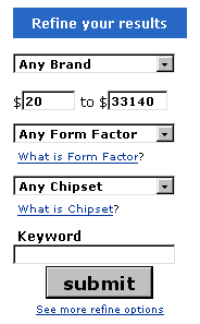
And, speaking of cranky moods, here's a blast from the past. I wrote an article kvetching about the search offered by Dealtime.com way back in October of '02. I complained about the fact that when you blanked out the minimum and maximum price fields, they were re-filled with the old values. [03/25/2004 - Link to Dealtime removed - it's being forward to shopping.com]
 Well today, March 14th 2003, I received a comment from someone presumably at Dealtime explaining that they showed the lowest and highest prices for that category. In the category in question, the highest was "33140", which I'd assumed was a maximum default, not a real price. It was not clear whether that was a real price or not.
But pre-filling the values is not the annoying part: re-filling the maximum after I had deleted the text is. They took user input and threw it away.
A better approach is the way Photoshop does it. I want a lot of files on my most recently used list. So everytime I (re)install or reset my Photoshop preferences, I punch in 100, and Photoshop substitutes the max. And it tells me what's it doing, getting the closest it can to what I asked for.
In the Dealtime case, I would find it less annoying to have a 0 substituted than the original big maximum number. Or, if you're doing something as disruptive as changing user input, you may as well show an alert box explaining, look, this number is the max, even though it doesn't look like it.
In usability as in life, you have to look like you're doing the right thing, as well as actually doing the right thing.
Posted by Chad Lundgren on Friday, March 14, 2003 (Link)
Most Popular
- Seattle Sunset background image
- Usability applied to life
- Is "My Bad" Bad?
- Free Password Previewing Tool version 2.3 (146 Kb)
- Sunset in New Mexico background picture
- Bath and Body Works
- Atkins.com: Lose the Table Fat
General
Other Web Logs
Categories
- Adminstrative: 11 entries
- General: 51 entries
- Personal: 2 entries
- Photography: 13 entries
- Poetry: 8 entries
- Usability: 71 entries
Archives
- October 2006
- February 2006
- July 2005
- June 2005
- March 2005
- December 2004
- September 2004
- August 2004
- July 2004
- June 2004
- May 2004
- March 2004
- February 2004
- January 2004
- December 2003
- November 2003
- October 2003
- September 2003
- August 2003
- July 2003
- June 2003
- May 2003
- April 2003
- March 2003
- February 2003
- January 2003
- December 2002
- November 2002
- October 2002
- September 2002
- August 2002
- July 2002
- June 2002
- May 2002

Unless otherwise expressly stated, all work on this site including photos, poems, and web logs entries are licensed under a Creative Commons License.